
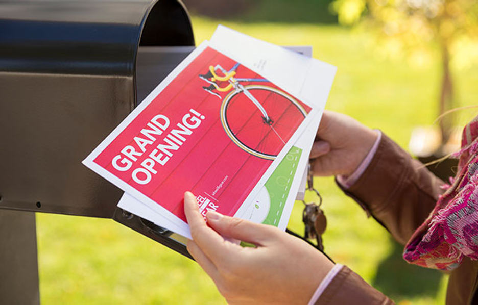
Having trouble getting your ads to stick?
It’s not just the word, but also the mood you’re designing a postcard for mailing your desired message.
Choosing a color scheme that makes people feel something and gets them to act by using color psychology is what every marketer should know today.
So, don’t guess at the pattern. Here’s for you a complete guide to painting a convincing masterpiece.
What Is Inside Color Psychology?
As a company or brand, your tone is important and colors make your tone impactful. It changes how we feel and act without us even realizing it. Therefore, knowing about color psychology could change how you sell and design.
If we simply see this, color psychology looks at how different colors can change how we feel, act, and think. It looks at how shades make people feel. So you must find a direct mailer service if you don’t know how to make colors speak your brand!
Researchers have found that colors can change your mood, make you hungry, or make you anxious. So why shouldn’t it be studied while designing marketing strategies?
Optimizing color psychology is good for both artists and marketers because changes in color can have an impact on branding, sales, and the number of people who buy something from a website. The data-driven design makes the most of color in the design.
When making ads and images, think about the ideas of the brand and the people you want to reach. Next, look at how color changes speech and feeling.
In short, graphic design and marketing materials look better when you know about color psychology.
Important notes:
- The psychology of color is the study of how color changes our thoughts, feelings, and actions.
- Colors have symbolic meanings that depend on culture and personal experience.
Color Meanings and Associations: What Color Means to People?
People strongly respond to and connect colors because, in many cultures, certain colors have come to mean something. These colors have different meanings for different people, but some colors always mean the same thing.
Just for example, we see that passion, anger, love, danger, and warning are all shown by the color red. Both blood pressure and attention go up.
In design, the color red stands for youth and bravery. Therefore, food brands use red, which makes people hungry.
Similarly, blue stands for safety, peace, and certainty. Blue, which people believe, is a common brand color.
- Darker blues are worn by guys and professionals.
- Light and cool blues soothe and heal.
Green stands for health, wealth, renewal, and the environment. It’s most peaceful for the eye. In marketing, the color green can stand for money, desire, or wealth. Light greens stand for new growth.
The color purple also stands for wealth, faith, and royalty. Because it’s not made very often, it’s a valuable color. Violet makes you remember things. Luxurious dark purples and light purples that are charming and girly.
Hence, knowing how colors relate to each other and what they mean can help designers choose palettes that fit with a brand’s values and positioning. So, choose them wisely!
Picking Out Colors for a Brand
Pick the right core color for your brand’s visual personality to make a good first impact and connect with your audience. With your major accent color, you should match the look of your brand and impress people who might buy from you.
Color choices for branding:
- How should your business make people feel? Warmth is felt in red, orange, and yellow. Some people think that blue, purple, and green are more professional, calm, and real.
- Check out the colors of your rivals. Your company should look great. Try to pair it with something different that goes well with it.
- Find out the age, gender, and lifestyle of your audience to find out what colors they like. Everyone likes blue and green.
- Check that your color looks good on signs, in print, online, and on digital media. Colors don’t always transfer well from one media to another.
- Change your pictures up to date by choosing something that goes with seasonal color schemes.
Simply pick a color that goes with the name and logo of your brand. There shouldn’t be any conflict with your visual character.
| Additional Examples of Picking Colors: |
| Finance: Blue, green, grayBeauty: Pink, purple, blackSports: Bold primaries, team colorsNon-profits: Earth tones, green, blueEducation: Red, blue, yellow |
With your target audience, just as an A/B testing, try out different colors to see what works and makes your brand feel “ownable.” Do not follow the others and pick a color that attracts people.
Mixing Colors And Contrast
When you create with more than one color, think about how the colors work together.
There are naturally lively and appealing color choices, but if you don’t choose them carefully, others could look off.
Use of matching and contrasting colors is very important. Colors like blue, purple, and green that are cooler and darker stand out. In the same way, color schemes that are all one color but have different tints, tones, and shades of that color can also look strong and stylish.
When putting colors together, think about how they look on the color wheel.
Contrast is smaller between colors that are next to each other than between colors that are opposite each other.
Certain things stand out more in high-contrast color combinations than in low-contrast ones.
I think you should use one main color to center the palette and colors that are opposite each other to draw attention to specifics.
Patterns that use similar colors look good together. So, pick bright yellow or electric blue to stand out.
| NOTE: Too many colors that are different from each other can make it hard to see. Limit your colors to two to four, with one main color. Adding color levels is possible by covering large areas of the background with gray, beige, or white. In a beautiful way, black and white can smooth out bright colors. |
Conclusion
With careful choice of colors for marketing designs, you can make palettes that look good, fit your brand, and appeal to your target audience. It may take a few tries before you find one that works for your style, mood, and message. So, just don’t get to the marketing part without realizing how color psychology works. Understand it completely to drive amazing results out of your marketing campaigns!